
Hub links: how to use
Each section is a full-bleed Row with one variant class in Advanced › CSS Classes. The class is the Figma background plus alignment: hub-links-white-center, hub-links-white-left, hub-links-light-slate-center, hub-links-light-slate-left, hub-links-light-blue-center, hub-links-light-blue-left. The Row holds a Container with the intro (subtitle Text, Heading, intro Text) and a Buttons element; then a Column Group where each column is one card (Image, Heading, Text, one Button); then a final Buttons element with the “View All” link. Copy the whole row onto your page, then change the text, links and card images.
Cards
- Use 4, 3 or 2 columns in the Column Group; the cards share the row evenly from 1100 px, sit two per row on tablets (991–1099 px) and stack on phones (up to 990 px).
- The card’s white panel, rounded corners, shadow and small blue button come from the theme. Delete the last Buttons element if the section needs no footer link.
- For more cards than one row, add a second Column Group under the first: each Column Group is one row of cards, 30 px apart.
CTA Grid
- The last three rows on this page are the Figma “CTA Grid”: the cards on their own in 2, 3 (two rows) and 4 columns. It is the same Row and class with the intro Container and the footer Buttons removed. On tablets (991–1099 px) rows of four cards go two per row while rows of three or two stay across; on phones every card stacks.
What to ask your designer for
- Card photo: JPG, exactly 800 × 426 px (396:211, landscape), sRGB, under 100 KB. Name it
<name>-800x426.jpg. Set it as the card’s Image; no mobile version is needed. - Reference files in
media/wysiwyg/components/hublinks/:hub-card-heating-800x426.jpg,hub-card-refrigeration-800x426.jpg,hub-card-events-800x426.jpg,hub-card-air-quality-800x426.jpg.
What we do
Our specialist services
CRS delivers end-to-end climate control solutions across a broad range of sectors throughout the UK & Ireland — backed by our nationwide network of engineers and depots.
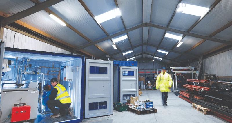
Heating & Cooling
Hire boilers, chillers, heaters, and air conditioning units for short or long-term contracts. Ideal for planned maintenance, emergency cover, and high-criticality applications.
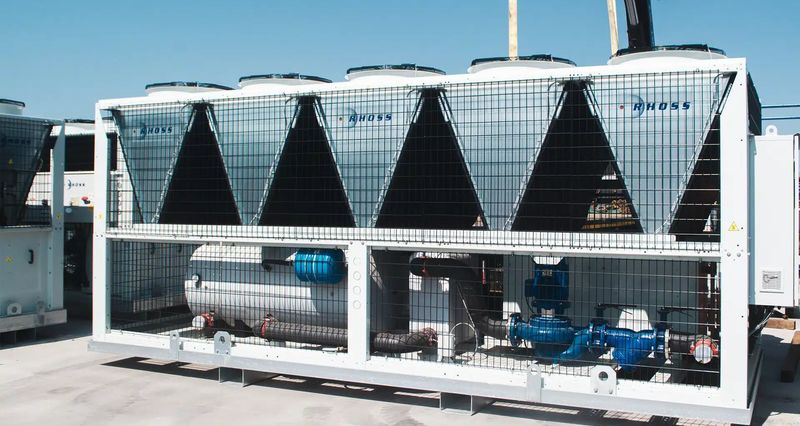
Refrigeration & Catering
World-class refrigeration and catering equipment on flexible rental contracts. Market-leading long-term retail refrigeration hire across the UK & Ireland.

Event Climate Control
Temporary heating, cooling, and air conditioning solutions for events, exhibitions, and outdoor venues. Rapid deployment with 24/7 support throughout your event.
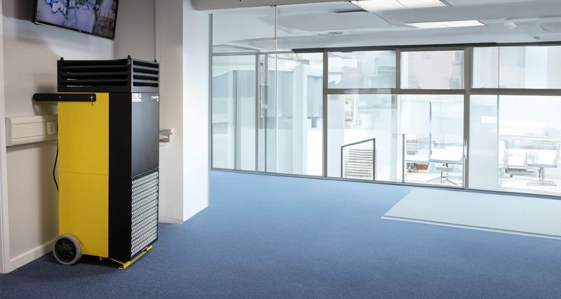
Quality Air Management
Advanced air purification and dehumidification hire, featuring HEPA filtration and thermal disinfection technology for improved indoor air quality.
What we do
Our specialist services
CRS delivers end-to-end climate control solutions across a broad range of sectors throughout the UK & Ireland — backed by our nationwide network of engineers and depots.
Heating & Cooling
Hire boilers, chillers, heaters, and air conditioning units for short or long-term contracts. Ideal for planned maintenance, emergency cover, and high-criticality applications.
Refrigeration & Catering
World-class refrigeration and catering equipment on flexible rental contracts. Market-leading long-term retail refrigeration hire across the UK & Ireland.
Event Climate Control
Temporary heating, cooling, and air conditioning solutions for events, exhibitions, and outdoor venues. Rapid deployment with 24/7 support throughout your event.
Quality Air Management
Advanced air purification and dehumidification hire, featuring HEPA filtration and thermal disinfection technology for improved indoor air quality.
What we do
Our specialist services
CRS delivers end-to-end climate control solutions across a broad range of sectors throughout the UK & Ireland — backed by our nationwide network of engineers and depots.
Heating & Cooling
Hire boilers, chillers, heaters, and air conditioning units for short or long-term contracts. Ideal for planned maintenance, emergency cover, and high-criticality applications.
Refrigeration & Catering
World-class refrigeration and catering equipment on flexible rental contracts. Market-leading long-term retail refrigeration hire across the UK & Ireland.
Event Climate Control
Temporary heating, cooling, and air conditioning solutions for events, exhibitions, and outdoor venues. Rapid deployment with 24/7 support throughout your event.
Quality Air Management
Advanced air purification and dehumidification hire, featuring HEPA filtration and thermal disinfection technology for improved indoor air quality.
What we do
Our specialist services
CRS delivers end-to-end climate control solutions across a broad range of sectors throughout the UK & Ireland — backed by our nationwide network of engineers and depots.
Heating & Cooling
Hire boilers, chillers, heaters, and air conditioning units for short or long-term contracts. Ideal for planned maintenance, emergency cover, and high-criticality applications.
Refrigeration & Catering
World-class refrigeration and catering equipment on flexible rental contracts. Market-leading long-term retail refrigeration hire across the UK & Ireland.
Event Climate Control
Temporary heating, cooling, and air conditioning solutions for events, exhibitions, and outdoor venues. Rapid deployment with 24/7 support throughout your event.
Quality Air Management
Advanced air purification and dehumidification hire, featuring HEPA filtration and thermal disinfection technology for improved indoor air quality.
What we do
Our specialist services
CRS delivers end-to-end climate control solutions across a broad range of sectors throughout the UK & Ireland — backed by our nationwide network of engineers and depots.
Heating & Cooling
Hire boilers, chillers, heaters, and air conditioning units for short or long-term contracts. Ideal for planned maintenance, emergency cover, and high-criticality applications.
Refrigeration & Catering
World-class refrigeration and catering equipment on flexible rental contracts. Market-leading long-term retail refrigeration hire across the UK & Ireland.
Event Climate Control
Temporary heating, cooling, and air conditioning solutions for events, exhibitions, and outdoor venues. Rapid deployment with 24/7 support throughout your event.
Quality Air Management
Advanced air purification and dehumidification hire, featuring HEPA filtration and thermal disinfection technology for improved indoor air quality.
What we do
Our specialist services
CRS delivers end-to-end climate control solutions across a broad range of sectors throughout the UK & Ireland — backed by our nationwide network of engineers and depots.
Heating & Cooling
Hire boilers, chillers, heaters, and air conditioning units for short or long-term contracts. Ideal for planned maintenance, emergency cover, and high-criticality applications.
Refrigeration & Catering
World-class refrigeration and catering equipment on flexible rental contracts. Market-leading long-term retail refrigeration hire across the UK & Ireland.
Event Climate Control
Temporary heating, cooling, and air conditioning solutions for events, exhibitions, and outdoor venues. Rapid deployment with 24/7 support throughout your event.
Quality Air Management
Advanced air purification and dehumidification hire, featuring HEPA filtration and thermal disinfection technology for improved indoor air quality.
Heating & Cooling
Hire boilers, chillers, heaters, and air conditioning units for short or long-term contracts. Ideal for planned maintenance, emergency cover, and high-criticality applications.
Refrigeration & Catering
World-class refrigeration and catering equipment on flexible rental contracts. Market-leading long-term retail refrigeration hire across the UK & Ireland.
Heating & Cooling
Hire boilers, chillers, heaters, and air conditioning units for short or long-term contracts. Ideal for planned maintenance, emergency cover, and high-criticality applications.
Refrigeration & Catering
World-class refrigeration and catering equipment on flexible rental contracts. Market-leading long-term retail refrigeration hire across the UK & Ireland.
Event Climate Control
Temporary heating, cooling, and air conditioning solutions for events, exhibitions, and outdoor venues. Rapid deployment with 24/7 support throughout your event.
Quality Air Management
Advanced air purification and dehumidification hire, featuring HEPA filtration and thermal disinfection technology for improved indoor air quality.
Heating & Cooling
Hire boilers, chillers, heaters, and air conditioning units for short or long-term contracts. Ideal for planned maintenance, emergency cover, and high-criticality applications.
Refrigeration & Catering
World-class refrigeration and catering equipment on flexible rental contracts. Market-leading long-term retail refrigeration hire across the UK & Ireland.
Heating & Cooling
Hire boilers, chillers, heaters, and air conditioning units for short or long-term contracts. Ideal for planned maintenance, emergency cover, and high-criticality applications.
Refrigeration & Catering
World-class refrigeration and catering equipment on flexible rental contracts. Market-leading long-term retail refrigeration hire across the UK & Ireland.
Event Climate Control
Temporary heating, cooling, and air conditioning solutions for events, exhibitions, and outdoor venues. Rapid deployment with 24/7 support throughout your event.
Quality Air Management
Advanced air purification and dehumidification hire, featuring HEPA filtration and thermal disinfection technology for improved indoor air quality.